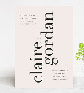
Hello, raddest moodboard ever. But what do you expect when someone like designer Justina Blakeney (we’ll just assume you’re already following her Pinterest…) lends her creative genius to paper? Pure magic! She just hooked up with Wedding Paper Divas to present a line of wedding invitation suites that can only be described as botanical, bohemian perfection. Check out our Q&A with Justina + peep the collection in the photos Desi Baytan’s photos:

What inspired you for this collection and how did you work that into the designs?
I love to seek out beauty in nature. When thinking about this collection I channeled an idea my mother often shared with me about marriage. “Look for a mate that you can grow together with,” she’d often say. So for this collection, I thought about that and the beautiful nature that I am surrounded by on a daily basis here in Los Angeles. I channeled the idea of growth, of abundance, of blossoming and tried to inject the collection with those sentiments.


This flatlay styling by Danae Horst is pretty amaze in itself. We sure love beautiful collabs.


How does home décor influence the invite world?
Great question! For me, home décor is all about having fun with colors, patterns, and plants and about creating an environment that feels cozy and inspiring, and a place where you feel totally free to be yourself. For this collection, I took those ideas and translated them into one dimension for these invitations! I think that, to make an analogy, an invitation is to a party like curb appeal is to a home—most of the time if a home looks inviting and fun from the curb, you can expect to find the same inside.


What was your process in creating the collection?
I created most of the artwork for the collection while traveling. I take watercolors with me wherever I go. Sometimes I paint on planes, in cafes, and late at night when everything is quiet. Once all of the artwork (mostly patterns and some photography) was agreed upon, I worked closely with the creative team at Wedding Paper Divas to create the graphics and the coordinating prints for all of the elements in the creative suites, from the envelope liners to the RSVP cards.

Some real-life bohemian botanicals in these centerpieces by Viva Voce Designs…


Do you have any tips on mixing pattern/color/texture throughout a wedding?
I think the easiest way to think about mixing things up to create a great palette at a wedding is to pick two or three dominant colors and then include as many patterns as you want within that color range. For my wedding we chose yellow and grey, but did not pick to any particular shade of either, so my bridemaids picked their own dresses and showed up in all shades of yellow/gold/marigold, the groomsman showed up in all shades of grey/charcoal and the look was put-together but still relaxed and fun. Same with our florals. Yellow was the dominant color but we used the colors as more of a loose guideline and then played within those parameters. I would also say to pick a metallic color for the wedding, as that can inform choices like flatware and accent pieces, and also help make the whole party look cohesive.
Really, how could you not take this gal’s advice after seeing these shots? Pop over to Wedding Paper Divas to shop the full line!
Designer: Justina Blakeney for Wedding Paper Divas / Photographer: Desi Baytan / Styling: Danae Horst / Florals: Viva Voce Designs / Props: borrowed BLU & Taylor + Taylor
