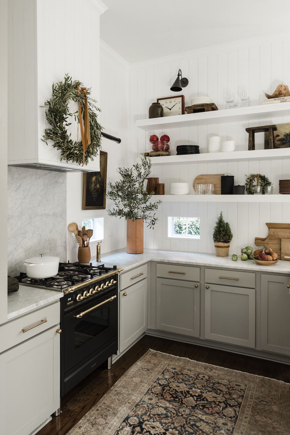

Hi Cakies! I’m so so excited to share with you my kitchen makeover today. For those of you just following along, my husband and I recently purchased our first home. It was a flip, so we’re updating areas as we go to infuse our personality. You can click over to see our front porch makeover, our bedroom closet, kids shared closet, and office.
To give you a little background, the moment I walked into this kitchen (see before below) I knew I wanted to do open shelving. So much so, that before we even moved in, I purchased the shelving. A little impulse purchase but I knew what I wanted. Overall our house has a bungalow/craftsman vibe. I wanted our kitchen to feel modern + clean but also have a little modern farmhouse vibe. Watching too much Fixer Upper, perhaps? ha!

As you can see the before wasn’t horrible at all. This is why we loved the house. It was move-in ready and we could easily update little moments to give it more of that “wow” factor. What do y’all think? I’m obsessed with the dark lowers even though we have dark floors. We went with Farrow and Balls Railings. Maybe one day we’ll update to lighter floors. I’m also crazy about the Fireclay Tile. I worked with them directly to create the ideal pattern. I shared my inspiration, which initially had more of a traditional pattern, and then they shared this inspiration, and I was like THAT’S IT!!! We used this 3×9 in Sugar. Doesn’t it give the kitchen more height? It’s also so much easier to clean! In case you’re wondering, we used a light gray grout in platinum. Who knew that was going to be such a big decision?

I have to admit, one of the hardest decisions was the lighting. Everything else seemed so easy. I knew I wanted a farm sink, duh! And found the perfect one at Kohler. I also thought it would be nice to pair it with a more industrial style faucet, which is heavenly. It seriously makes cleaning in the kitchen a breeze and… sort of fun. I don’t think I ever thought I’d say those words. After renting a home with crappy kitchen for so many years coming home and standing in front of this sink is everything. Okay, maybe with a glass of vino in hand.

Going back to the light. I struggled with the size, shape, color, you name it. Cedar and Moss has so many amazing lighting choices. It was truly hard to decide on the final direction. But once I shared my design ideas with their team they helped me narrow it down and pick the right sizing. We went with the Alto pendant and Tilt light. The hint of brass on the lights with the black is the perfect complement to the brass knobs, right?


Me happily perched by the sink!


Okay, now onto the 2nd best thing about our kitchen. Right off of it is our laundry room. As you can see below, it was a blank slate and in need of some serious love. What better way to breathe new life into a space than with wallpaper? I’ve been obsessed with Justina Blakeney’s entire line of products, but especially the wallpaper. The laundry room is also the perfect space to add a bit of color and whimsy. I chose Justina’s pattern by Hygge and West. All the colors in the wallpaper nicely complement the darks in the floor and cabinets and bring in a little of the outdoors with the leaf pattern. What do y’all think? Wallpaper in the laundry is a yes, right? On a side note, we were able to repurpose our kitchen cabinets into the laundry room. Bonus!


1. Fireclay tile / 2. Cedar & Moss / 3. Black Stool / 4. Rug / 5. Kohler Faucet / 6. Brass Drawer Pulls / 7. Brass Drawer Knobs / 8. Kohler Farmhouse sink / 9. Cedar and Moss / 10. Hygge & West wallpaper / 11. White chairs / 12. Ikea Lamp / 13. Custom Floating Shelves

Hope you all enjoyed the makeover as much as I do. Are any of you doing a remodel? We’d love to hear because we’re all just a wee bit obsessed with home projects right now, ha! xo, Jillian


