This post is a long time coming! I wanted to do one recap here of our overall home renovation, just so, you know, I could document it all in one place. You’ve seen the master bathroom plans and final result, and the dining room and backyard, and here we are with the rest of the house! It’s kind of satisfying to see it all together. Keep reading for all the details below, with photos by Jeff Mindell…

The living room architecture was the very first thing we worked on when we first moved into the house, 5 years ago. The ceiling used to be 8ft and the walls painted peach (see here, here and here for our ceiling reno). Oy! We knocked out the ceiling, vaulted it, installed skylights and painted the entire thing a nice white. Behr Snowfall, to be exact. Whewww, so much better.
We’ve collected various furniture pieces over the years, as one does. The Room & Board couch was one of our first purchases in the room, and everything else kind of played off that. We opted for a super light gray (nearly white) couch, which brightened the space up even more. It’s fared surprisingly well so far, with only a few minor spills that were easily cleaned.


I never really had a big plan for the design of our house. I just collected things my husband and I liked, and hoped that it all came together in the end. Of course I’m a big sucker for a clean bright space, but I also love color and am a lifelong pattern junkie, so you’ll see whimsical little patterns showing up all througout the home. Block Shop came out with these new rugs awhile back and I just couldn’t resist.

They also make nifty prints! I have a couple of their pieces, including the one over our fireplace, beautifully framed by Simply Framed.


Collecting ceramics and wall hangings is a definite past time of mine. My husband jokes that we’ll have to start hanging any new pieces in our attic, or build more walls for all of them. I rotate them out from time to time, to freshen up a space. Here are a couple of my favorite ceramics from A Question of Eagles and M. Quan.


A new company I discovered this year, Lostine, makes so many gorgeous things, including that wooden ball lamp. It’s probably my favorite piece in this room.

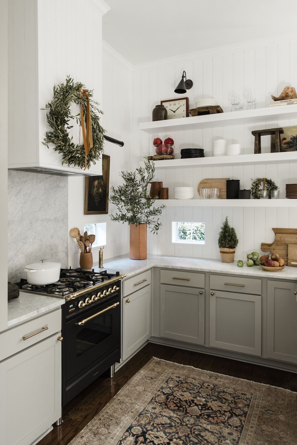
Once the living room ceiling was tackled, a year later we moved onto the kitchen. The entire thing was gutted and reconfigured. A doorway from the kitchen to a guest bathroom, and another to an alley were removed and replaced with lots of cabinet space. Cararra marble, gold hardware, open walnut stained shelving and white herringbone tile were chosen to complete the space.


Supporting smaller artisans and furniture makers is so important, and I’m fortunate enough to have some pieces from companies I admire. Renata Stone is quite possibly a fiber magician. I had her make this piece for our dining room (and the giant one at our event space Festoon). The leather sling chairs are from Hati Hati.

 Betsey Carter made this ceramic and rope wall hanging and I do a little happy dance when I walk by it. I purchased the wooden hanger here.

Our bedroom is the most serene room in the house with a calming color palette and a few brass accents, including the sconces by One Forty Three. Our bed and rug are CB2, and bedding from Parachute Home.


I looked everywhere for a dresser to perfectly fit a narrow space in our bedroom, and found the Tallboy dresser by 57St. Design. They have some lovely solid hardwood pieces with beautiful hand-rubbed finishes, and they’re based out of Chicago too, which is amazing! Their furniture is influenced by various design traditions like American Shaker, Scandinavian modernism and traditional Japanese woodworking.


Here’s a peek at the master bathroom, which you can read all about our process and see before’s here!

We worked with Semihandmade on our cabinet fronts for the laundry room. They have so many good ones to choose from, and we went with a black shaker style for a little drama in that room.

And onto the kids/guest bathroom! We wanted this room to be fun for our son, but not too juvenile because it also had to be fitting for our guests. The Cletile was our first purchase in here, inspired by our vacations in Italy, where the ornate tiles are an integral part of the design in so many restaurants, shops and homes.
The bit of color was added with the fun Quiet Town Marfa shower curtain, which we can change out when our little guy is older. The rest of the bathroom we kept pretty neutral with our white Cedar and Moss sconces and matte black hardware. All other bathroom fixtures are from Wayfair.

And the nursery!.. the room I most enjoy spending time in with our 1 year old guy. It’s a mix of light and airy-ness with fun sprinkled in, of course. Brooks loves hanging out in here and scattering all his toys around, as they do. The Kalon crib is convertible, for when he grows out of his crib. Other favorite pieces in here are the Niknik wall hanging, the Electric Sun Creatives brass mobile and our Oeuf dresser.


And last but not least… the dining room! I wrote a bit more about it here, but it’s such an artful spot for us all to gather for dinnertime.
So there you have it! One year of our lives, all wrapped up in a nutshell. I had the most fun ever creating this space, although it didn’t come without its hardships and a handful of tumultuous moments. It feels so amazing to come home and kick our feet back and enjoy the fruits of our labor! Thanks for stopping by to read all about our little abode!


Photography: Jeff Mindell
Living room sources: couch | coffee table | console | console lamp | floor lamp | rattan pendant | mirror | bench | sling chairs | macrame | woven poufs | artwork and framing
Kitchen: counter stools | open shelving | pendants
Bedroom: bed | bedding | side tables | sconces | dresser | rug | pillows | wall hanging | mirror | stools
Master bathroom: tile | mirrors | sinks | sconces
Laundry room resources: cabinet doors | hardware | wallpaper | tile


